top of page
Comparing Editions
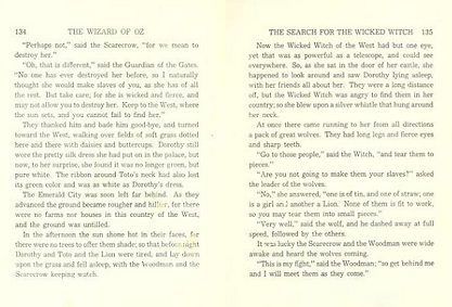
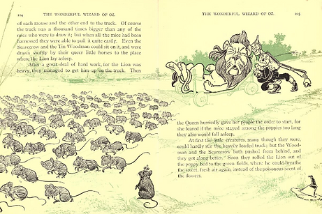
After the first published copies of The Wonderful Wizard of Oz, the number and quality of the illustrations started to suffer. This was most likely for the sake of cost to the publisher ultimately to increase profit. One of the things that set The Wonderful Wizard of Oz apart was the way illustrator, W. W. Denslow, weaved illustrations into the text. It was an unusual and innovative technique at the time (Evina, 2000).
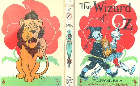
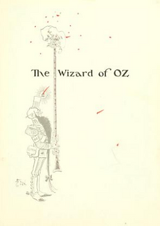
In the 1956 edition, the most vibrant color illustrations are focused in places where a consumer can easily see: the front cover and endpapers. But the rest of the front matter: title page, introduction, chapter list and dedication feature illustrations printed simply in black ink.
None. Advertisement of works by L. Frank Baum
Standard with a full
color illustration
FRONTSPEICE
TITLE PAGE
None.
2 title pages each with a blank verso; half title page is not standard and includes an illustration with a few colored elements
INTRODUCTION
COPYRIGHT
TABLE OF
CONTENTS
Folklore as 2 words instead of one; Chicago, April, 1900 is in small capitals
Found on verso of table of contents page (below); text includes year of copyright, creator credits for the author (L. Frank Baum) and illustrator (W.W. Denslow), states "all rights reserved", and followed by 3 stylized seahorses that are Denslows trademark or a signature of sorts (Evina, 2000); features an illustration;
List follows shape of illustration;
Chapter numbers are in roman numeral form;
Chapter titles are in regular case;
No page numbers are listed;
Illustration and background color are used on the page
Folklore as 1 word and has a drop cap; Chicago & date are presented in regular case; different illustrations
On verso of introduction page; text includes year published, publisher, and printing country; features an illustration
List is uniform;
Chapter numbers are standard;
Chapter titles are in small caps;
Page numbers are listed;
Illustration is included on verso
Dedication information is identical with the exception of an ampersand in this version. The typeface is the same used for the copyright page and very similar to the title page.
DEDICATION
Dedication information is identical with the exception "and" spelled out. Stylistically, "My Wife" is presented in small caps in this version, instead of the bold text used in the original.
Body matter
Chapter Opener
(1900)
Chapter title and opener pages are included for all 24 chapters. All include the special typeface seen in the copyright and dedication pages, and a single color background with a black and white illustration. The chapter titles and openers in the 1900 edition always appear on the recto side of the pages with an empty verso proceeding the opener.
Inserted between the chapter title and opener pages above is a color plate. The color plates in this edition seem to be printed separately, possibly on a different kind of paper, and placed before being bound. All of the 24 color plates in the 1900 edition appear on a recto and are followed by a blank verso on the back side of the plate page.
Each chapter in the 1956 edition begins with an illustration and a drop cap. The chapter name isn't announced until the header of the following rector.
Chapter 15 title page, 177 (1900)
There are no blank pages in the body entire body matter of the book. Illustrations and color plates are a single color, instead of a black and white line drawing with colors. The illustrations aren't identical in placement, but in the case of the 1956 edition, the illustration on page 133 was moved to the chapter opener page from 1900's page 177.
Full color plate; have four colors (dark blue, red, yellow, and pale blue);
includes a quote as a caption
FULL PAGE
ILLUSTRATIONS
One color print;
No caption
Appears to be in Century typeface family,
specifically similar to schoolbook type
TYPEFACE
Monotype Old Style
(what is now called Bookman Old Style)
Illustrations interwoven into text (1900)
Same page in 1956 edition
Illustrations as backdrop to text (1900)
Same illustration (1956)
back matter
Special Note & close up

Afterword by Edward Wagenknecht
(please note in the archive.org scan the last few pages are out of order)
bottom of page


